Refined colour palettes made easy
Planning a wedding is full of decisions and when you reach the finer details, it can quickly start to feel overwhelming. Suddenly, it’s not just about the big picture. It’s:
What shade should the candles be?
Should the napkins match?
Do we need a pop of colour in the flowers?
What colour should the ties be?
What shades should the bridal party wear?
It’s a lot.
This guide is designed to simplify that process - helping you create a refined, cohesive colour palette, and more importantly, showing you how to apply it with intention throughout your wedding.
We’ll build your palette in three layers: foundations, accents, and grounding shades.
Step One: Finding Your Foundations

Start with a Pinterest board or mood board that captures how you want your wedding to feel.
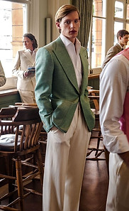
Once you have it, take a screenshot and place it alongside a colour wheel. Look at your board as a whole and identify the most dominant or recurring colour. This is your starting point. For example, mine is green.
Find the closest match to that colour on the wheel.
From here, we create what’s known as a split complementary palette. While direct complementary colours can be bold and striking, for your foundation we’re aiming for balance and softness.
To do this, take the colour opposite your primary on the wheel, then select the two colours on either side of it. In this case, that gives us tones of red and purple.
Complementary

Split complementary

Rather than pulling these shades directly from the colour wheel (which would be much too saturated), sample them from your mood board instead. This keeps everything feeling curated and intentional.
I typically use Procreate for this, but the colour picker in Instagram Stories works just as well.
At this stage, you’ll have your core palette.

Purple
Green
Red
Step two: choosing your accents
Next, we introduce accents - the details that add depth and a touch of contrast.
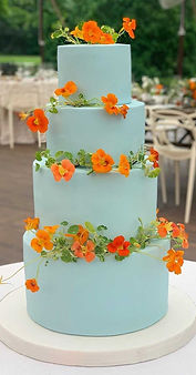
From your primary colour, move two to three steps clockwise around the colour wheel. For me, this lands on blue.
For accents, we can afford to be a little bolder. This is where direct complementary colours work beautifully - so in this case, blue paired with orange.

Again, sample tones from your mood board rather than the wheel itself. The goal is harmony, not harsh contrast.
These will become your moments of visual interest.

Blue
Orange
Step three: add grounding colours
Finally, we anchor everything with grounding shades.
Traditionally, this sits within black and white - but this can (and should) be softened to suit your overall aesthetic. Think:
White - cream - beige
Black - steel - light grey
For my board, cream and black feel the most aligned.
These shades bring structure and balance, allowing your palette to feel complete.


Step four (optional): add depth
If you’d like a little more flexibility, you can introduce tonal variation within each colour - just keep it considered.
Aim for no more than three to four variations per colour to maintain that refined, editorial feel.


But how do I apply this?
Large scale = foundation and grounding (venue / backdrop, bridal party, installations, florals)
Small scale = accents (accessories, cake, statement arrangements)